23 Jun Color Perception in Digital Printing
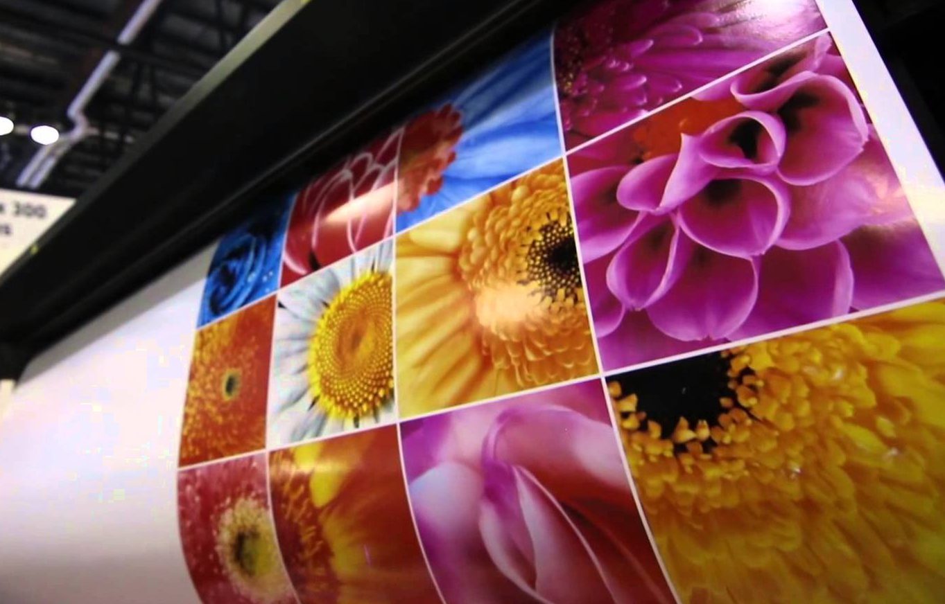
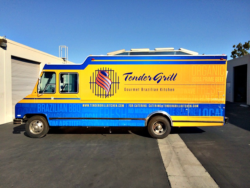
Color matching is one of the most important details in large format digital printing. The task of matching the shade seen on a computer screen to the tone that leaves the printer can sometimes be tricky, especially when printing something as large as a vehicle wrap or banner. It relies on a solid understanding of how the human eye perceives pigments and many years of practice.
What We Know About Color Perception
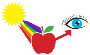
Isaac Newton taught us that objects themselves do not actually possess color. Rather, the surface of those objects reflect certain light wavelengths and absorb the rest. 
Each human perceives color slightly differently than his or her peers because of slight differences in the makeup of our eyes. Therefore, it is necessary to universalize color matching so that everyone is speaking the same language when it comes to printing or matching the correct hue.
There are a few primary methods of creating uniformity in colors. The Red, Green, and Blue mode is one where all colors are created using a percentage of red, green, and blue light. This is used for anything light based: televisions, computers, phones, etc. The Cyan, Magenta, Yellow, and Key Color mode is similar to the RGB mode with just one main difference. Colors in the CMYK system are subtractive from the brightness rather than additive. CMYK is generally used for business cards, posters, signs, and so on. The Pantone Color Matching system is a standard color reference, which is based on numerical ink colors rather than ratios of color. The PCM mode is very common for home design.

Contact Us Today!
How it Affects Digital Printing
Translating the color you can see on a computer screen to the color that actually appears once this image is printed can be tricky. Experts in printing will know exactly which mode to use under which circumstance and how to match colors in that “language.”
The computer system must also be properly calibrated so that shade that appears on the monitor screen is the same as the one that leaves the printer. Any errors in this calibration can lead to unpredictable results in printing.
The surface on which the colors are printed does matter. Different substances, like vinyl or paper, take the pigments differently.
Matching the correct hue is a specific, detail-oriented process that must be done conscientiously. At Full Sail Graphics & Marketing, we take every part of the design experience very seriously. We value our customers and will do all the little things to make sure the end result is as close to perfect as possible.
With over 50 years of combined experience in graphics and marketing, the Full Sail Graphics team is confident that we will deliver quality graphics on time and on budget. If you’re looking to improve your marketing efforts, please feel free to give us a call at (714) 451-8428 or visit our website at http://fullsailgraphics.com .

