16 Oct Color Psychology
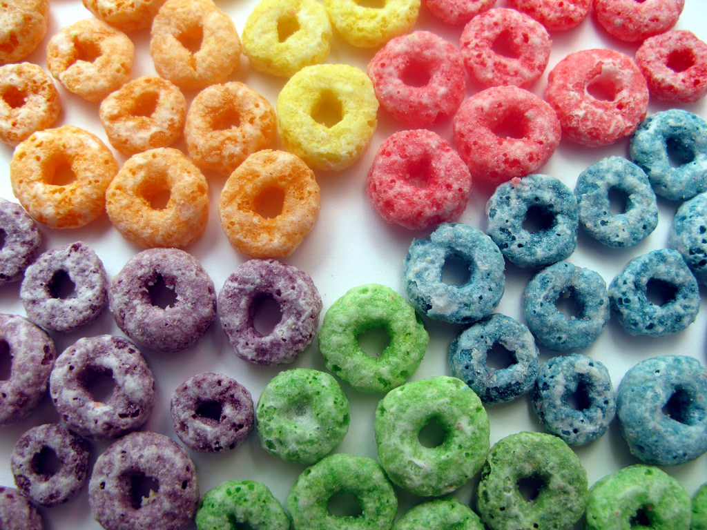
Color sends strong messages that tend to evoke particular thoughts or emotions in the human mind. For decades, this theory has been used to improve advertising techniques.
Red is considered to be a very strong, bold color which
colors, leading car manufactures to showcase their signature vehicles in red. Yellow is the brightest color the human eye can recognize. It evokes feelings of happiness, cheerfulness, and energy. Orange, a combination of the two, represents sun, life, and warmth. This fun, bright color is thought to stimulate mental activity. These three warm colors are thought to increase the desire for food. Think about fast food restaurants like McDonald’s or Carl’s Jr… They intentionally use bright colors to attract
customers and increase appetites.
Cool colors like shades of green, blue and purple are utilized to create an entirely different mood of relaxation and stability. As nearly all plants contain some element of green, the color has come to represent growth, 
advertising. Blue shows wisdom, trust, and loyalty. For these reasons, it is popular amongst large businesses, universities, hospitals, airlines, and the flags of several nations. It is thought that the use of blue will instill a deeper sense of trust between the customer and the business.
Purple is unique because it combines the calmness of blue with the boldness of red, making it a color quite fitting for leadership. For centuries it has been the color of kings, queens, and nobility.
Black and white are fascinating colors because their contrast makes them work so flawlessly together. Black on its own sends an ominous vibe, while white is used to represent something that it pure and good. Together, the two are used in design to create a formal, modern, and luxurious environment.
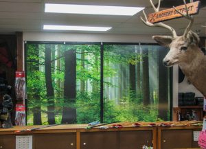
Colors are such an important element in the design of vehicle wraps, signs, displays, banners, wall/window graphics, etc. Changing the color scheme on a vehicle wrap or a wall graphic can literally change the entire message that wrap sends.
With over 50 years of combined experience in graphics and marketing, the Full Sail Graphics team is confident that we will deliver quality graphics on time and on budget. If you’re looking to enhance your brand, please feel free to give us a call at (714) 451-8428 or visit our website at http://fullsailgraphics.com.


